Printable Version of Topic
Click here to view this topic in its original format
GMC Forum _ GMC site feedback & suggestions _ Front Page Revamp?
Posted by: Canis Mar 31 2009, 04:26 PM
I was showing a friend of me GMC earlier today. The first comment I was expecting to hear was "Whoa, this place is great!" but was disappointed when he said "The front page is untidy..."
I don't mind the front page the way it is, since I've grown used to it. But I wonder if it can seem a bit confusing for new members.. So I was wondering if there was a "repolish" of the front page on the agenda, to make it a bit more user-friendly?
I would atleast like to see an expanded news-box where the news are easier to spot and read 
Just to be clear; I am not complaining about the current design as I've grown to love it like my home.. But even houses need refurnishing now and again? =)
Posted by: Kristofer Dahl Mar 31 2009, 05:16 PM
Yes this is something we want to get done! Suggestions are very welcome (preferably with posts including images so we can understand what you mean)
Posted by: Canis Mar 31 2009, 07:30 PM
Here's a quick example I made with my insane Paint-skills 
Not a huge difference, but makes things a little cleaner: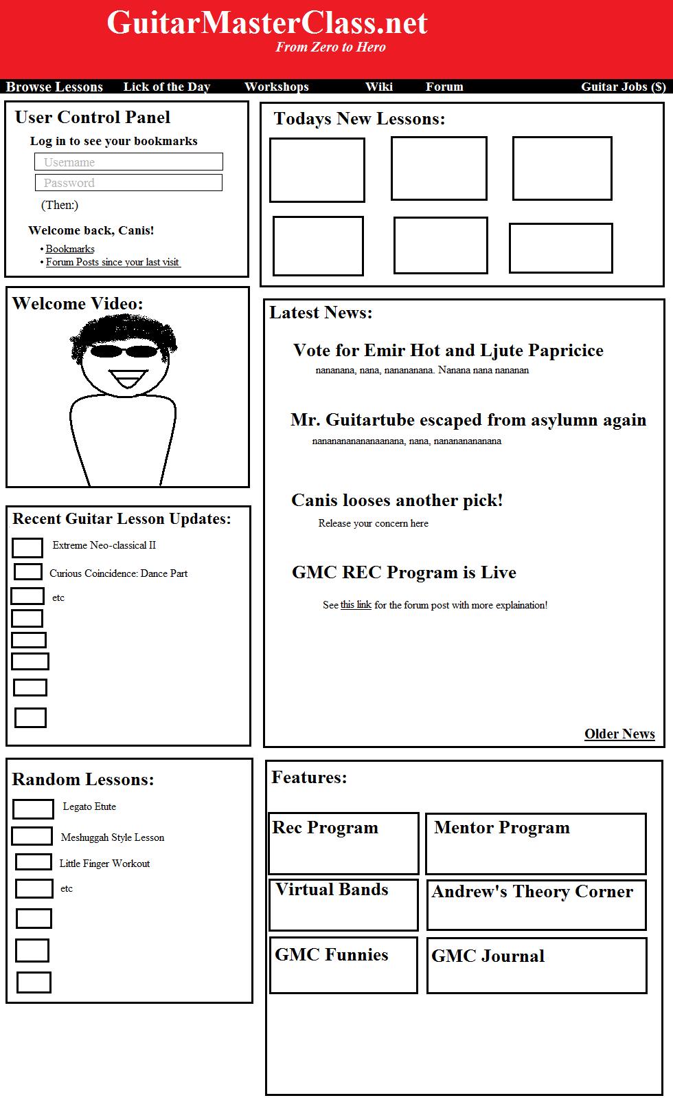
To get a little more room, the random lesson bar could be moved into another box, while it stays at the same place in the lessons and everywhere else where it usually show, of course =)
Posted by: kaznie_NL Apr 1 2009, 08:23 PM
The black bar with links (forum, guitar jobs etc.) is used very much, maybe make this a more important part of the page?
Posted by: Jakub Luptovec Apr 1 2009, 08:33 PM
The intro video could be popping out, playing ABOVE the rest of page, when finished, it could just slip away from page thus leaving more space for other things..
Posted by: Pavlov Apr 1 2009, 09:10 PM
"Canis loses another pick! Release your concern here."
Made me laugh out loud. Perhaps I am easily amused, but that was funny. Also, yes, I agree, a friend whom I'm trying to introduce said the same thing.
"The intro video could be popping out, playing ABOVE the rest of page, when finished, it could just slip away from page thus leaving more space for other things.."
To be honest - no. I don't want that every time I open the home page. It's a bit screamish, it does yell 'I'm a great guitar player and probably a great teacher', but it does 'yell' it.
Powered by Invision Power Board (http://www.invisionboard.com)
© Invision Power Services (http://www.invisionpower.com)