Printable Version of Topic
Click here to view this topic in its original format
GMC Forum _ PRACTICE ROOM _ New Gmc Design
Posted by: Kristofer Dahl Jul 23 2009, 09:33 PM
During this last month we have been working on a new design - which our beloved site has deserved for so long.
Below you will find some screen shots of work-in-progress. We are very interested in hearing what you think about the design + if you have got any improvement suggestions. Here are some sample pages:
START PAGE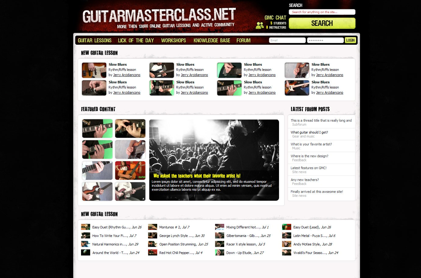
edit - If you click one of the 8 images below "featured" content the large middle area will change. This will give us new possibilities to showcase instructor weeks, lesson series, competitions, GMC events etc
LESSON PAGE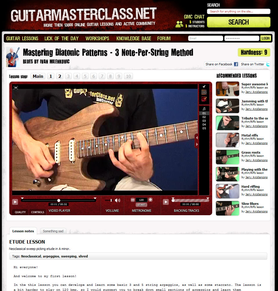
[new] COMMUNITY PORTAL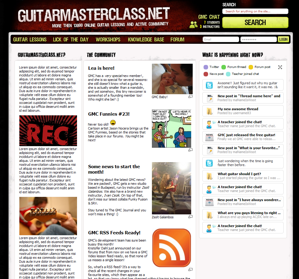
The "What is happening Now?" column will refresh automatically - so that you can follow the most recent GMC community updates with ease
GUITAR LESSON CATEGORIES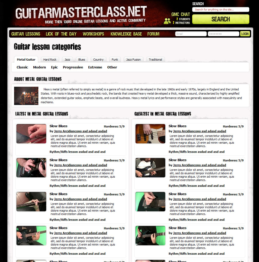
PS Never mind typos etc. Also "Knowledge Base" is just a new name suggestion for our ever growing wiki!
Posted by: superize Jul 23 2009, 09:37 PM
Looks cool
Posted by: ZakkWylde Jul 23 2009, 09:41 PM
Looks great although I can't really tell if it's good until i have browsed through the actual thing...
Posted by: jafomatic Jul 23 2009, 09:42 PM
Wow, Kris! That's so much more professional looking, it's fantastic! The actual lesson page really stands up to scrutiny with those cosmetic tweaks.
Lookin' great.
Edit: Unrelated to the actual site design change is that I find the lesson mockup amusing. Looks like Aleksander's lesson, Ivan's name, and Conrad's forum avatar.
Posted by: steve25 Jul 23 2009, 09:44 PM
The greenish on the banner looks fine but on the navigation bar it looks a tad weird. The rest all looks fine though
Posted by: jdriver Jul 23 2009, 09:44 PM
Nice, especially the Community Portal page, I'd make that my new start page.
Posted by: skennington Jul 23 2009, 09:46 PM
I like the ideas so far Kris.  However, I would like to see a more "in your face" logo. Maybe a different font style?......Maybe Pristina in italics?
Posted by: playaxeman Jul 23 2009, 09:47 PM
Kris,
Looks cool. 
Some positive comment on the first picture (the home page):
I understand the first banner and last banner "new lesson"
Would be great to see the hardness at the same time for both.
I don't understand the "featured content" because the only thing I see are pictures without text what they represent.
I wouldn't do a picture in the middle (waht is the use of it?) rather have some links to the lessons categories grouped by there style and hardness, or see more lates post by forum type.
Cheers
Robert
Posted by: Dexxter Jul 23 2009, 09:48 PM
I like it a lot! ...if it weren't so messy  I think having some kind of borders and having the different sections a lot more defined, would make a GREAT difference. A bit more space between stuff. And the lesson page.. the lesson itself and the difficulty showing and all that.. it seems too close to the top , if you get what I mean. This applys to all the pages btw. But especially the lesson page.
The top links and banner seems a little stuffed, some more room here woul improve things also. Maybe smaller text and a wider banner?
But don't get me wrong, the design looks awesome! It's just the layout I'm a little concerned about
I appreciate all the work you've done and do for making GMC a better and cooler place! Keep up the good work, and I hope you consider my suggestions
Posted by: Bogdan Radovic Jul 23 2009, 09:51 PM
Wow this new design looks really modern and eye catching to me! I really like it , log in directly on the front page is great feature.Also it seems there is so much more space to promote all the new lessons coming up! Its a really GMC 2.0 upgrade
Posted by: Kristofer Dahl Jul 23 2009, 09:51 PM

I wouldn't do a picture in the middle (waht is the use of it?) rather have some links to the lessons categories grouped by there style and hardness, or see more lates post by forum type.
Oops forgot to explain that one - if you click one of the 8 images below "featured" content the large middle area will change.
This will give us new possibilities to showcase instructor weeks, lesson series, competitions, GMC events etc
Posted by: NoSkill Jul 23 2009, 09:52 PM
It has a nice feel to it, Kris.
Posted by: jafomatic Jul 23 2009, 09:54 PM
I wonder if Jerry knows how many different guitars he'll be stealing from the other instructors in the future?
Posted by: Kristofer Dahl Jul 23 2009, 09:56 PM
Yeah I always suspected he stole guitars!
edit - Where is my parker by the way?!

Posted by: playaxeman Jul 23 2009, 10:00 PM
This will give us new possibilities to showcase instructor weeks, lesson series, competitions, GMC events etc
Well that is a great feature then.
Posted by: TreyDeschamp Jul 23 2009, 10:11 PM
Looks great Kris but the "Lick if the Day" button. Should you take that out? Is there ever actually a like of the day? Because every time I go in there, there is always the same Metallica type thing.
Posted by: Ivan Zecic Jul 23 2009, 10:27 PM
This looks great! I would only change the backgorund color to "GMC red", or something a bit darker, so the windows look a bit more separated.
Posted by: Muris Varajic Jul 23 2009, 10:38 PM
I'm not gonna bother anyone, it looks sweeeeeeeeeet!!
Posted by: Kristofer Dahl Jul 23 2009, 10:48 PM
Good point - the lick of the day feature is certainly getting outdated. However we have new plans for that one as well!
Posted by: Pedja Simovic Jul 23 2009, 10:54 PM
This looks great Kristofer, well done for GMC team.
I have one personal preference, yellow color just doesn't do it for me
Posted by: Lian Gerbino Jul 23 2009, 11:06 PM
wow!!! this is really cool Kris!
oh! and Jerry also uses black nails 
Posted by: Jerry Arcidiacono Jul 23 2009, 11:11 PM
edit - Where is my parker by the way?!
Naaa... I'm Jerry Arcidiacono, not Arcidiancono
This could be another instructor, so don't ask me about your guitars 
Nothing wrong with the black nails since I'm a big Nuno fan
I
Posted by: Bogdan Radovic Jul 23 2009, 11:13 PM
This could be another instructor, so don't ask me about your guitars Nothing wrong with the black nails since I'm a big Nuno fan
I
Can you ask your friend when can I have my bass back? I'm starting to miss it
Posted by: Jerry Arcidiacono Jul 23 2009, 11:25 PM
Sold right now on Ebay... sorry

Posted by: audiopaal Jul 23 2009, 11:26 PM
Looks great Kris, much better
Looking forward to the new design
Posted by: Matt23 Jul 23 2009, 11:34 PM
Looks cool. It'd be nice if we could keep the random lessons list though, or at least the option to have it. It'd be a real shame for me if it was to go. 
Yeh, gotta agree with you there.
I have one personal preference, yellow color just doesn't do it for me.
I agree with that as well.
Also I think "Wiki" sounds better than "Knowledge Base". And this might be a typo but I think it's a bit dishonest to say 13000 Guitar Lessons when there is 1759. Maybe you should say 13000 videos or something like that.
Btw don't get me wrong, I appreciate all the work you're doing, and I think the new design looks great. I'm just pointing out some things I think could be improved.
Posted by: Emir Hot Jul 23 2009, 11:40 PM
Very cool refreshment. Congrats to the team.
Posted by: Kristofer Dahl Jul 23 2009, 11:53 PM
It's a typo! All text is just there to show you how it will look - if you look closely you will see there is non-sense text all over the place!
Keep the feedback coming - we will discuss all the things mentioned here and see what we can make of it!
Posted by: Mrblomme Jul 23 2009, 11:57 PM
Wow this looks sweet Kris!
Posted by: Velvet Roger Jul 24 2009, 12:08 AM
Looks all nice!
The only thing that keeps going around in my head when I look at it is that greenish/yellowish color .... dunno whether I actually like it or whether I dislike it  . When there is a white background, I definitely dislike it though.
Posted by: wrk Jul 24 2009, 12:44 AM
I really like the new design in the main content area. The rounded boxes with shadows are nice and clean !! I'm a fan of shadows so this part is great imo ... 
I'm not so sure about the top area tho(?). The site was before mainly red, black and grey ... so i like the idea to add another highlight color to make it more fresh.
But what about to use another texture/color as the red one you used for the player, top navigation and headline area? .. don't know, just an idea ..
Posted by: Sergio Dorado Jul 24 2009, 12:49 AM
It looks really cool! Can´t wait to see it
Posted by: Tsarpf Jul 24 2009, 01:03 AM
Everything looks gooood!
Except for the smaller text "more thEn xx lessons" under the big guitarmasterclass.net text at the frontpage
Isn't it typed "more than"? I'm just not completely sure, because you see the "more then" version so frequently at forums and such. 
Posted by: Chokehold Jul 24 2009, 01:16 AM
Looks great, can't wait.
By the way, what does that latin text say?
Posted by: Fran Jul 24 2009, 01:49 AM
Looking great! Featured content & community portals look awesome. New font types spice it up too, can't wait
Posted by: Ramiro Delforte Jul 24 2009, 03:06 AM
Amazing new look!
I can't wait to see it online
Posted by: TreyDeschamp Jul 24 2009, 03:35 AM
Awesome kris! secret or is the plan aloud to be told?
I have one personal preference, yellow color just doesn't do it for me
I'm with you. Black and Purple? Thats just my color input
Posted by: newguyatgmc Jul 24 2009, 04:32 AM
Need to change that yellow colour...other wise i think its great
Posted by: Koopid Jul 24 2009, 06:16 AM
Love it
Less messy than the old one, modern and sleek. I think it looks great. Yellow is ok, but not *that* yellow
Posted by: Gerardo Siere Jul 24 2009, 06:29 AM
It looks awesome!
Posted by: Fusion Jul 24 2009, 07:53 AM
Awesome!
thank you
Posted by: Kristofer Dahl Jul 24 2009, 08:08 AM
Well the plan is not so well defined yet - but we have discussed for over a year to create much cooler "lick of the day":s. (perhaps with an instructor competition or similar..?)
Posted by: Oxac Jul 24 2009, 08:40 AM
Looks astounding. However I have one thing that I believe needs to be changed.
The font you're using for headings (the one for "New Guitar Lessons" "Freatured Content" "Latest Forum Posts") is very hard for me to read, even though it's larger than the regular text. My poor eye-sight will be rectified in a couple of weeks, but easier accessability for those with poor eye-sight it could be a good Idea to get another font.
// Ox
Posted by: JVM Jul 24 2009, 09:05 AM
Since the lick of the day is partly there to entice people to subscribe, it might be helpful in that regard if the licks were provided by students

Posted by: Laszlo Boross Jul 24 2009, 09:11 AM
It looks great! Congrats to the team!
Posted by: Jad Diab Jul 24 2009, 09:56 AM
wow the new design looks great
Posted by: Nighthawk1 Jul 24 2009, 11:07 AM
I do like it Kris looks fresh and modern !
Some question
- What is the knowledge base about?
- when will the new desgin be finished?
Personally I wouldn't change the the GMC lettering into capital letters. And what's with the GMC slogan Zero to Hero?
Thanks
Posted by: Kristofer Dahl Jul 24 2009, 11:36 AM
Some question
- What is the knowledge base about?
- when will the new desgin be finished?
"Knowledge base" is a new name suggestion for the wiki. We can't tell for surewhen the new design will be out - but if we don't encounter too many unexpected problems I hope we can get it this fall.
I am glad to see many people like the color new scheme (I personally love it - I felt strongly that the combination we have had lacks "liveliness" - which the new yellow/green color cures). Credit for this and the design in general goes to Mathias Petterson who works with Henrik.
Part of the idea with the design upgrade is to get some new ideas and perspectives - just as everyone should do with their guitar playing: Question your progress, strengths and your weaknesses. Also you need to change your habits and include fresh new ideas - otherwise you will get stuck in a rut and sound predictable and boring. We need to do the same with GMC.
Some of the things we will implement will be bad and others will be good - we usually won't really know until we try. However we can always fix things and improve - that's what we are doing right now!
Posted by: Ivan Milenkovic Jul 24 2009, 04:55 PM
Looks great and a smart move Kris, this certainly looks professional and definitely raises the design quality level. I have one suggestion only and that is to possibly experiment more with different fonts for the main GMC top banner.
Awesome work!
Posted by: Alexiaden93 Jul 24 2009, 04:56 PM
Awesome new look, Kris ! What I find weird, though, is that under the heading "LATEST IN METAL GUITAR LESSONS" (pic. 4), there are loads of lessons on blues...
Posted by: Matt23 Jul 24 2009, 05:42 PM
Since there seems to be quite a lot of people who like the new colour scheme and quite a lot of people who don't. Maybe there could be a choice of colour schemes.
Posted by: Vasilije Vukmirovic Jul 24 2009, 10:40 PM
I like the new homepage....central picture is great. Though it may be useful to put some guitarist picture instead....
nice design.
Posted by: Canis Jul 24 2009, 10:48 PM
I love it! Personally, I like the yellow as well ^^
If there's one thing I'd like to keep though, it's the random lesson bar. Not nessicary on the front page, but somewhere on the lessons? A lot of the lessons I've found to treasure, I've found through that bar. Unless the "Recommended Lessons" on the right is the same thing, just with another name?
Posted by: sigma7 Jul 25 2009, 06:13 PM
wow, this is really cool....im getting really excited!!!!!!!!!!!!!
Posted by: Darfuria Jul 27 2009, 10:31 PM
I think there should be some clarification in the sections of videos on the homepage, as it currently seems as if you have New Videos, Featured Videos and New Videos. It would seem that the news feed has disappeared somewhere as well.
That green colour doesn't tie in with the design very nicely.
The slogan under the GMC logo could be better.
The line-height on the community portal could be increased to make it easier on the eyes.
Posted by: Zsolt Galambos Jul 28 2009, 02:51 PM
It's so cool! The site gets more and more professional, and the new look is just great!
Posted by: kaznie_NL Jul 31 2009, 03:10 PM
Waaaah... really cool!! I think one tiny thing might be that the (over)use of capital letters, as well as the yelow colours might be a bit screamy, you know what I mean? I think big improvement overall, looks very profesional, I especially like the lessons page!
Posted by: kaznie_NL Jul 31 2009, 07:29 PM
Also, maybe rethink about the workshop tab, what does it do? Maybe it's better to put an info page there like " What is GMC?" To make things even more clear for new members!
Posted by: kaznie_NL Aug 1 2009, 08:42 PM
Update 3 I now think the yellow looks cool for the bar with the links Forum, Worskhop ETC. but at the right top, iwth the search button it's a bit to much.... don't delete all the yellow
sorry giving my opinion six times
Posted by: Toni Suominen Aug 11 2009, 12:06 PM
Looks sweet!
Posted by: twist Aug 11 2009, 12:31 PM
Its so rounded everywhere I like it.
Posted by: Sensible Jones Aug 13 2009, 04:25 PM
I like it's look, although as I 've only been here 6/7 months or so I haven't got bored of the current look just yet!!!
Posted by: JVM Aug 17 2009, 09:29 PM
I'd like to make a few requests about the bookmarks section of the site. It would be really cool if eventually we could move the folders around and reorganize them. Also it would be nice to be able to organize lessons (within folders) by difficulty or instructor, or just alphabetically. Lastly, I noticed that when I was trying to edit the name of a folder while watching a lesson, some of the letters triggered functions like the metronome, which of course is a nice feature, but it shouldn't do that when you're typing.
Posted by: mattacuk Aug 17 2009, 09:32 PM
Looks nice and clean, very good!
The only thing im not keen on is the luminous yellow
Posted by: purple hayes Aug 18 2009, 01:02 PM
I'd recommend http://www.xmarks.com/ as an alternative. It syncs your bookmarks on every computer you use. Bookmark a new lesson at work and it will be on your computer when you get home.
I've got a GMC Lessons folder in bookmarks and then a sub folder for bass lessons and I put the difficulty beside each lesson.
Posted by: Kristofer Dahl Aug 18 2009, 02:02 PM
Definitely not - well spotted, reporting it right away.
Also, I agree that even more control over bookmarks would be great to have in the future.
Posted by: Neurologi Sep 2 2009, 01:40 AM
As I am but a noob here I am not sure if this is the appropriate forum to post my observations about the user interface experience in general? Since it seems there is change in the air, now is probably as good a time as any to do so.
The only suggestion I would make is in the video player itself. It isn't an earth shattering thing and I may well be the only one who even considers it a little irksome but here goes!
On the right we have the backing track list. Its title, if too long, is not visible. It doesn't scroll or allow you to resize to make it so. I may be stretching things a little by assuming it is a descriptive title and often contains things like bpm count etc. Since I am sure I am not the only one who flits back and forth between different lessons I am sure it will just make the experience just that little bit more comfortable by perhaps having the title scroll as it is being played - à la regular mp3 player?
That said. Keep up the good work! Apart from that little quibble I have been most impressed with the thought that has been put behind every facet of the design here to make it a most excellent ride and continues to get even better ...
I look forward to any and all improvements on the drawing board for the future.
BTW If you are looking for an alternate term for Wiki then how does "Repository" sit with you? That might be too big a word though, eh? In light of that, a better suggestion could be that of "The Vault" .... Now I am getting carried away. Anywho.
Also too, I think the original banner font for 'GuitarMasterClass.net' is more striking than the proposed one in the sneak peak. All caps doesn't really pop as it does now already. Excuse me if I over step my bounds, dear sir.
[EDIT] >> Doh! Found the answer to my woes! Just click the arrow, young man. Click the arrow. Well I ain't a clicker. I am more of a click-and-drag kinda guy ...
Posted by: kaznie_NL Sep 20 2009, 06:14 PM
any clue when this might get implanted? It looks so cool
Posted by: CathShadow Sep 20 2009, 06:46 PM
Hehe yeah I was wondering the same
Posted by: Matt23 Sep 20 2009, 06:51 PM
1+
Posted by: Kristofer Dahl Sep 27 2009, 09:28 PM
I hope we can live it during October..!
Posted by: Marcus Siepen Sep 29 2009, 10:36 AM
This new design looks absolutely cool, can't wait to see it go online I also think some more control about bookmarks might be a good thing by the way.
PS: There is just one flaw in the new design, I am not sure if it is a good idea to put a "Slow Blues" Lesson in the "Latest in Metal guitar lessons" category
Posted by: macseamus Oct 12 2009, 11:51 PM
looking good! The green snot colour wouldn't be my taste, but whatever you're having yourself.. like a few people have said, maybe offer a choice of styles.
In terms of functionality, there's a good few things that come to mind, in general, you could probably make it more funky and easy to use with more ajaxy type things. like for example, bookmarking a lesson could be done without having to reload the whole page.
Posted by: Praetorian Oct 14 2009, 08:53 PM
Looks great Kris! I think the GMC logo should be more prominent though. It kind of gets lost in the shuffle with all that stuff going on!
Posted by: earman Oct 15 2009, 12:35 AM
I like it. It's got attitude, it's clean, and the layout seems easy to navigate through. Bring it on!
Posted by: Adrian Figallo Nov 4 2009, 02:46 AM
just seeing this, it looks great, i think the site really needs a new design right now, and this one looks like a winner
Posted by: kaznie_NL Nov 15 2009, 09:44 PM
Any news on when it's going to be implemented? I can't wait
Posted by: Emir Hot Nov 15 2009, 10:27 PM
Was just going to ask the same
Posted by: Kristofer Dahl Nov 15 2009, 11:22 PM
Well I dare not give any more estimations since my last one was wrong - but I can inform you on the status.
* We are running two servers in parallel, the new (and more powerful) one has the new site version and is currently being tested and worked on. Having two servers is expensive so this yet a reason why we want this to be done as soon as possible.
* This has turned out to be much more than just a site re-design, we have changed a lot of the underlying scripts/systems. This will hopefully make future GMC development quicker and less painful.
I am quite nervous about how this will turn out as it is the biggest change we have ever done to GMC (on a short-term, users will only notice the difference in design though).
Posted by: Ivan Milenkovic Nov 16 2009, 12:27 AM
Wow, now I'm pretty excited to see how this will look!
Posted by: kaznie_NL Nov 16 2009, 03:12 PM
* We are running two servers in parallel, the new (and more powerful) one has the new site version and is currently being tested and worked on. Having two servers is expensive so this yet a reason why we want this to be done as soon as possible.
* This has turned out to be much more than just a site re-design, we have changed a lot of the underlying scripts/systems. This will hopefully make future GMC development quicker and less painful.
I am quite nervous about how this will turn out as it is the biggest change we have ever done to GMC (on a short-term, users will only notice the difference in design though).
And you won't give me the adress for the other server? Haha
It sounds coool!!! Can't wait
Posted by: newguyatgmc Nov 16 2009, 03:31 PM
Dont worry kris...the new design will work out fine. It has to ......cause there are so many good gmc souls praying for it and banking on it.
This is the first time I am seeing my avatar in my post..For some reason it never showed up before I love my avatar..I love GMC!!
Posted by: Bogdan Radovic Nov 17 2009, 12:34 AM
I can't wait for the change! Screenshots look great... These are really exciting times, first video chat now this
Posted by: Daniel Realpe Nov 17 2009, 01:54 AM
Looking good,
There's a slight element of home made in the actual one, so I think this one will take care of that,
Posted by: Sollesnes Nov 17 2009, 02:06 AM
I agree. Looking forward to it
Posted by: newguyatgmc Nov 17 2009, 01:58 PM
Last night I had a dream that I was surfing GMC with its new design. lol!!!...I guess I had too much gmc yesterday.
Posted by: Canis Nov 17 2009, 02:09 PM
There's never too much GMC, mate. There's never too much GMC...
Can't wait either =)
Posted by: Kristian Hyvarinen Nov 18 2009, 05:48 PM
Well, I know there's something going wrong with me, when whenever there's a silence during conversation with my pals, I start talking about GMC and everyone stares at me like I came from Mars.
They just don't understand.
Posted by: Keilnoth Nov 18 2009, 07:50 PM
When I talk about GMC to my friends they tell me : "Oh, sounds nice, will check it but I really don't have a lot of time because I spend my life practicing guitar."
They just don't understand...
Powered by Invision Power Board (http://www.invisionboard.com)
© Invision Power Services (http://www.invisionpower.com)