


Redesigned Ep Cover Art!, Analyzed Within |
|
|
|
|
Jan 14 2014, 10:48 PM

|
|
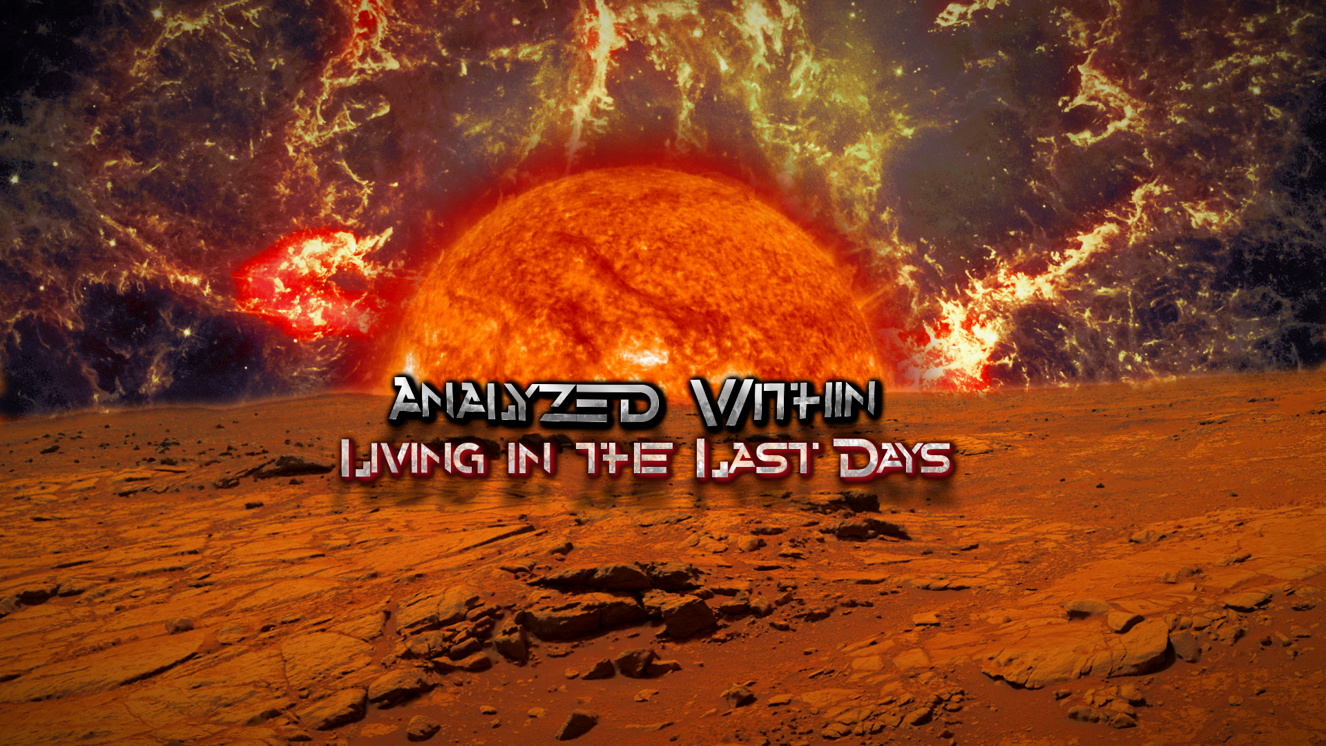
Hey guys, I redesigned my band's artwork for our upcoming EP. I talked to the studio guy and he is going to be working on the songs for mixing. So the EP is coming just as soon as he can get it done, and I am working on some bonus things in the background, this art being one.
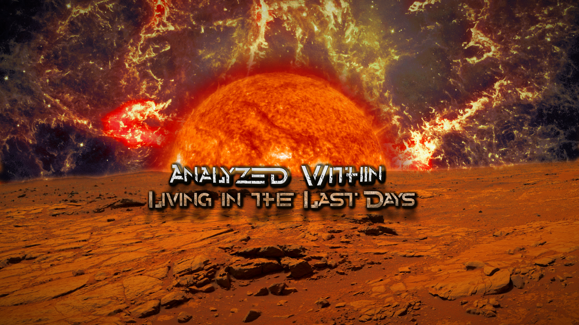
 After looking at the old one for a long time, I decided Analyzed Within needed better cover art for the release of the EP, "Living in the Last Days." I began searching online for someone else to take my concept and make it better. But I knew the turnaround would be about a week and would cost me a lot. We are giving this EP away, and we have already put a lot of money into this project, i.e. a $300+ mic in which we recorded vocals. What do you guys think of the finished piece? I spend hours last night compositing 3 NASA images and custom airbrushing the titles with the font of Alternity. I wanted it to look more apocalyptic than the previous art; thus, the sun looks like it's about to swallow the planet. The ground is actually Mars, a picture from Curiosity. The sky is a Crab Nebula with the colors tweaked to my original color theme, almost as though hellfire is in the sky. I tried to imagine what color the ground would be if this scene were truly unfolding. Actually, the human eye could not see this anyway - it would be too bright - the sun being a blinding blotch. When my brother creates album art he keeps in mind a wallpaper resolution instead of just the standard square ratio. It bugged me that I had not thought of that myself. Maybe people would want a wallpaper version that filled their whole screen too. So I have a square version with the sides cut off for the actual cover. I want to create a digital booklet. I wanted a 4K resolution (2160p), but the ground I was using wasn't that large, so I settled for 1080p. (Curiosity was in the way). I'll include the high-def photo in the release of the EP when you download it on Bandcamp. I wish I could set a release date but I don't know when our studio guy will be finished. But at least our part is done!  --Brandon |
 |
 
|
|


|
|
|
|
Jan 16 2014, 12:52 PM
|
|
Hi mate, I like it! It looks very professional and attractive. Congrats!
-------------------- My lessons
Do you need a Guitar Plan? Join Gab's Army Check my band:Cirse Check my soundcloud:Soundcloud Please subscribe to my:Youtube Channel |
|
|
|
|
|
|
|
|
|
Jan 17 2014, 04:38 PM
|
|
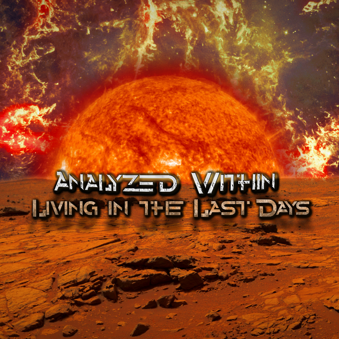
It's good to see this before the release so we can fix it. Thanks. I still have the project so I modified it. How does it look now?
Attached image(s)
|
|
|
|
|
|
|
|
|
Jan 19 2014, 08:55 AM

|
|
Much easier to read man! I think it's good like this
Here's the poster we did for the new single: 
|
|
|
|
|
|
|
|
|
|
Jan 20 2014, 07:38 PM
|
|
Glad to hear it did the trick. Though I did like the original how it looked like Analyzed Within was on fire.
|
|
|
|
|

|
|
|
|
|
Jan 22 2014, 09:07 AM
|
|
Cool mate - will it only be available in a digital form or will the artwork be developed into a physical booklet?
|
|
|
|
|
|
|
|
|
Jan 23 2014, 04:59 AM

|
|
Looking good! Maybe make the titles a bit bigger? They are a tad small in the frame overall maybe. Are you using photoshop? You can group all the layers in to one folder and then balance the overall color or turn it black and white then create your own color scheme etc. Just some ideas
QUOTE (thefireball @ Jan 14 2014, 04:48 PM)  Hey guys, I redesigned my band's artwork for our upcoming EP. I talked to the studio guy and he is going to be working on the songs for mixing. So the EP is coming just as soon as he can get it done, and I am working on some bonus things in the background, this art being one.
After looking at the old one for a long time, I decided Analyzed Within needed better cover art for the release of the EP, "Living in the Last Days." I began searching online for someone else to take my concept and make it better. But I knew the turnaround would be about a week and would cost me a lot. We are giving this EP away, and we have already put a lot of money into this project, i.e. a $300+ mic in which we recorded vocals. What do you guys think of the finished piece? I spend hours last night compositing 3 NASA images and custom airbrushing the titles with the font of Alternity. I wanted it to look more apocalyptic than the previous art; thus, the sun looks like it's about to swallow the planet. The ground is actually Mars, a picture from Curiosity. The sky is a Crab Nebula with the colors tweaked to my original color theme, almost as though hellfire is in the sky. I tried to imagine what color the ground would be if this scene were truly unfolding. Actually, the human eye could not see this anyway - it would be too bright - the sun being a blinding blotch. When my brother creates album art he keeps in mind a wallpaper resolution instead of just the standard square ratio. It bugged me that I had not thought of that myself. Maybe people would want a wallpaper version that filled their whole screen too. So I have a square version with the sides cut off for the actual cover. I want to create a digital booklet. I wanted a 4K resolution (2160p), but the ground I was using wasn't that large, so I settled for 1080p. (Curiosity was in the way). I'll include the high-def photo in the release of the EP when you download it on Bandcamp. I wish I could set a release date but I don't know when our studio guy will be finished. But at least our part is done! --Brandon |
|
|
|
|
|
|
|
|
Jan 23 2014, 06:37 PM

|
|
That definitely works
|
|
|
|
|
|
|
|
|
|
Jan 24 2014, 08:15 PM
|
|
Bigger emphasis on the name and title! Good work man
I was curious if there would be a booklet, how you would extend the concept of the artwork
|
|
|
|
|
|
|
|
|
|
Jan 25 2014, 07:13 AM
|
|
QUOTE (Cosmin Lupu @ Jan 24 2014, 01:15 PM) Bigger emphasis on the name and title! Good work man I was curious if there would be a booklet, how you would extend the concept of the artwork Basically in the lyrics i have the corresponding photos to tell the story of the picture, much like the ones I shared on facebook.  Still brainstorming on that one. Still brainstorming on that one.QUOTE (Todd Simpson @ Jan 24 2014, 08:00 PM) Much better! The one on the bottom puts the text in much better size relationship IMHO. Cosmin has a great point about the text being very important. The background is often there to emphasize the message of the text (band name/album name) and the bigger any element in the frame, the more importance the brain will attribute to it. Speaking of the message. I like the title "living in the last days" The image makes me thing of living after the last days since it's a desolate landscape as if the end times have been and gone. Have you considered using a cityscape or something with the large sun/planetoid hovering overhead as if it's going to "end" thing? Of course you don't have to re in force the message with the title and vice versa if you don't want Thanks Todd. The idea is to show the prophesy, maybe a little what it might look like as God is about to destroy the earth with fire. Just a concept really. A warning of what is to come, so get ready for we are "living in the last days." ... that kind of concept.
|
|
|
|
|
 
|
1 User(s) are reading this topic (1 Guests and 0 Anonymous Users)
0 Members: